Is there a conflict between responsive_framework and flutter_screenutil? #128
Description
My app runs on mobile, and uses both responsive_framework and flutter_screenutil.
In the app, there are two different designSize values for flutter_screenutil in two widgets (home page and live page).
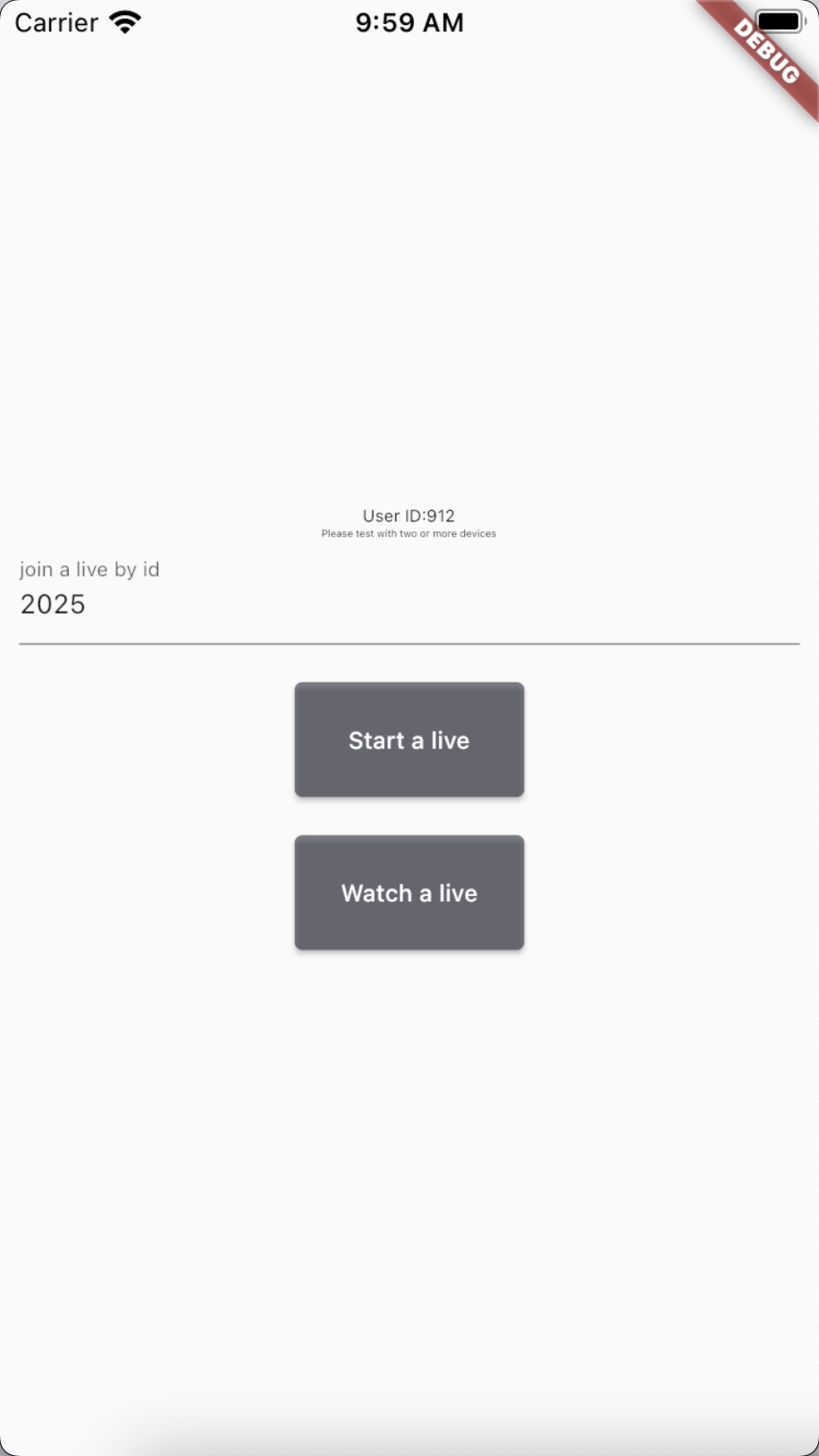
when switching back from the screen with a different designSize (live page),
I reset the previous screen's (home page) designSize using ScreenUtil.init.
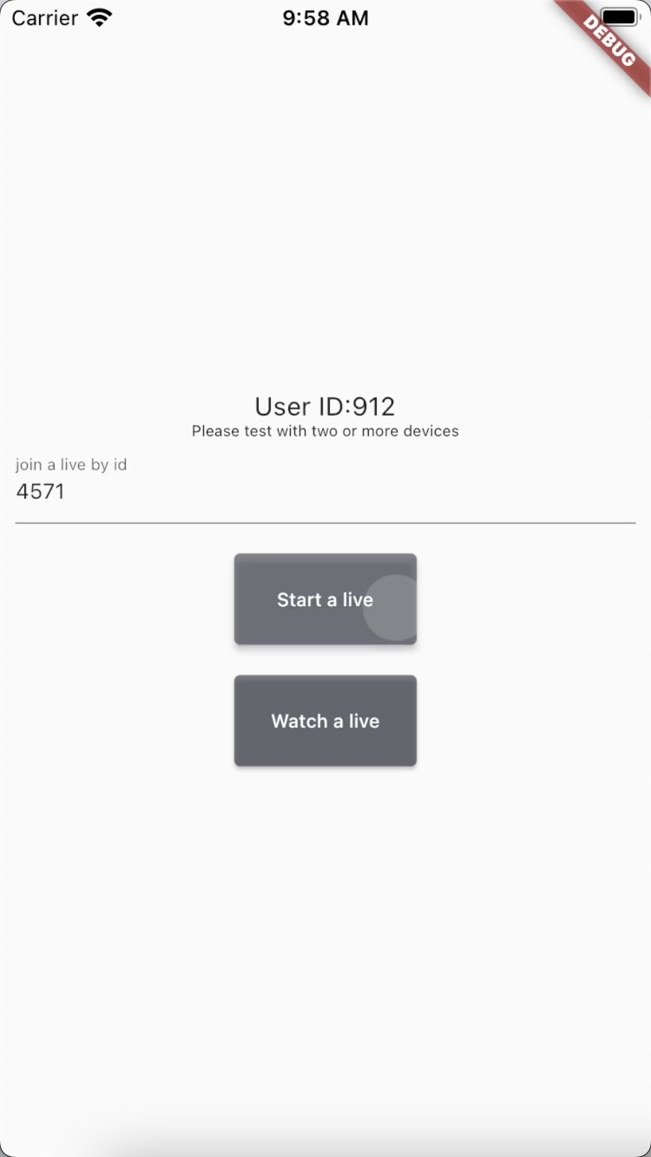
However, some elements in certain areas(user id part) of the home page interface are partially reduced in size.
I suspect that some of the size judgments in responsive_framework may have been affected.
Is there a method in responsive_framework similar to ScreenUtil.init for resetting the screen size?
App:
  @override
  Widget build(BuildContext context) {
    return ScreenUtilInit(
      useInheritedMediaQuery: true,
      rebuildFactor: RebuildFactors.all,
      designSize: Size(390, 844),
      builder: (context, child) => MaterialApp(
        builder: (context, widget) => ResponsiveWrapper.builder(
          widget,
          maxWidth: 1200,
          minWidth: 428,
          defaultScale: true,
          breakpoints: [
            const ResponsiveBreakpoint.resize(428, name: MOBILE),
            const ResponsiveBreakpoint.autoScale(800, name: TABLET),
            const ResponsiveBreakpoint.resize(1000, name: DESKTOP),
          ],
        ),
        home: HomePage(),
      );
  }
HomePage -> LivePage
LivePage:
  @override
  Widget build(BuildContext context) {
    return ScreenUtilInit(
          designSize: const Size(750, 1334),
          minTextAdapt: true,
          splitScreenMode: true,
          builder: (context, child) {
            return Container();
          },
        );
  }

  @override
  void dispose() {
    super.dispose();

   ScreenUtil.init(...);
 }